- PROJECT CASE STUDY -
155 Whare Awhina
NFP - Taitokerau Northland
Rocketspark Website Design
Social Media Graphics

Helping a community
155 Whare Awhina exists to help people and whanau in Northland. Their community whare is a place to come rest and find support.
Whether that is food parcels, housing support, law support, community development, or whanau support... there is a place to have a cuppa and talk, for those who need it.
Redesigning and rebuilding a website
Working alongside a fantastic copywriter, we teamed up to maximise the potential for 155 Whare Awhina's website. With many aspects to the organisation, we had to communicate and display the information in an easily accessible way while ensuring that enough information is shared for someone to make an informed decision.
The site content and structure was planned, written and optimised for SEO performance by Pippa Jayne Communicatons, which allowed me to focus on making sure all the design pieces fit together – team work at its finest!
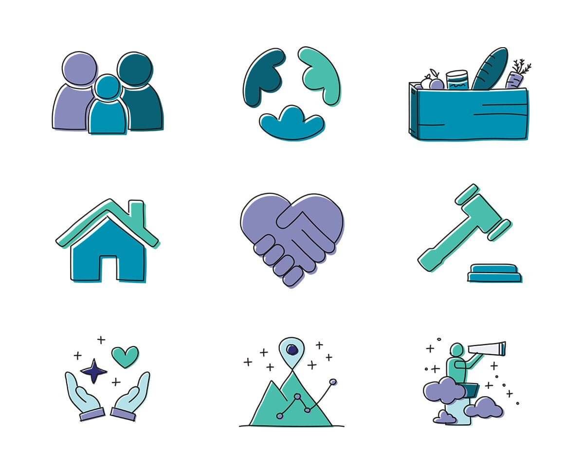
Bringing in additional branded abstract elements and custom illustration to reflect Northland's landscape, helped to cement an established logo and colour palette. The curved illustrations and layered coloured panels evoke and gently embrace the aroha, care and support received at 155.
You can see the Before/After of the web project here.
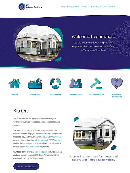
Gentle, nurturing waves symbolise the support received while bringing in a feel for Northland's landscape. The takutai (coast), the maunga (mountains), and the moana (ocean) are all represented in the hand drawn illustrations.
Branding Extension
Being provided with an existing logo and small colour palette set the tone and established look for the website. By introducing custom illustrations and elements, I was able to extend the brand and colour palette to branch out a little further. Icon illustrations were done in my signature style and are used throughout the site in their respective areas.
Texture, layers, curves, waves are the key factors driving the direction of the brand elements. Shapes of colour and texture are layered behind photos - just as people are full of layers. Waves add to these layers as they roll in, and blend into different designed sections. Curves are predominant, providing a gentle and soft approach to the overall website and designs. With everything softened, the design elements provide the 'safe place' feel to a previously sterile design. People will share in a safe place.
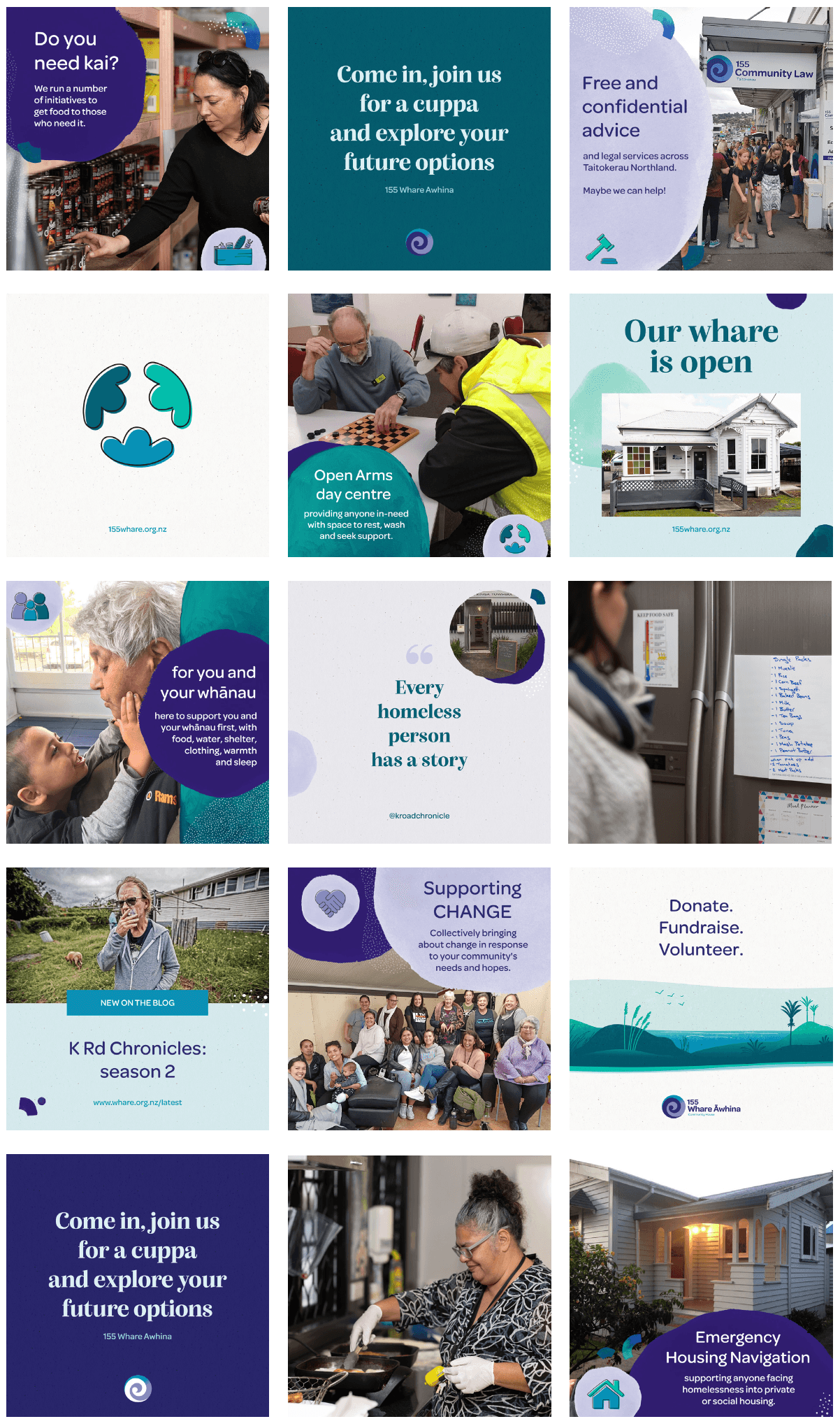
Social Media Templates
Harnessing the power of social media platforms is important for a community organisation to reach others. To help improve this, I created a series of template designs that could be used, and allow customisation to create further post or story layouts.
These templates empower the content creator to utilise consistent branding, while having their own control - without needing to fall back on me (the designer) to create flat, one-off graphics. Setting the templates up in Canva gives back the power to communicate what they need to, without any barriers.
Set styles were created for the different 'arms' of the organisation, with allowance to change the photo and text; but leaving an over-arching structure that can become recognisable over time. The new designs provide a cohesive brand look - especially crucial on social media feeds, where the content is displayed among other businesses/brands.