- PROJECT CASE STUDY -
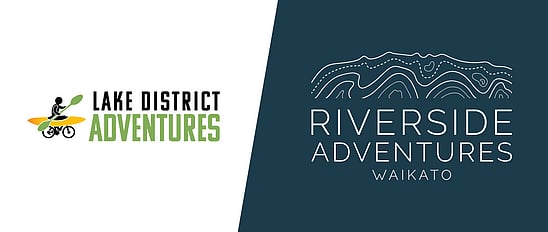
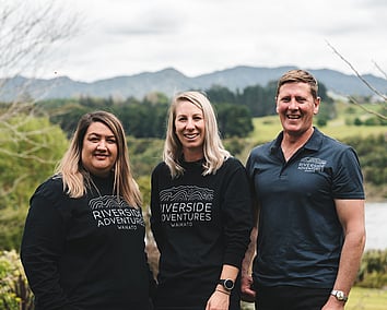
Riverside Adventures Waikato
- Brand Design & Strategy
- Signage Design
- Rocketspark Website
- Apparel Design
- Social Media templates

Web Design and Branding
Riverside Adventures Waikato offer adventure based tours - the kind that bring you a calming effect as you cycle the trails surrounded by Waikato bush, or as you paddle peacefully downstream listening to the water moving, gazing at the glowworms.
But how do you capture calm and adventure? Well, it took a bit of a bird's eye view...
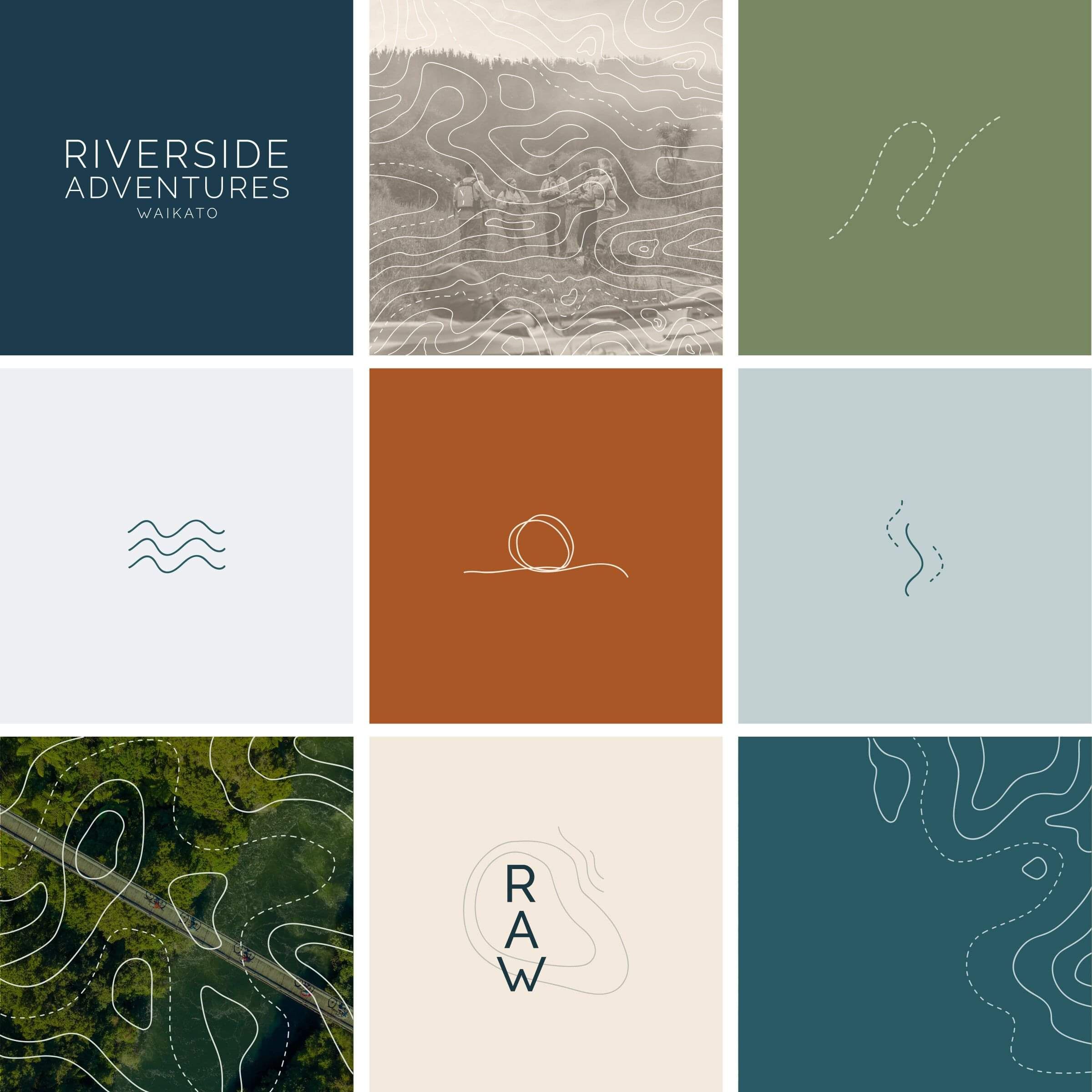
The rebrand
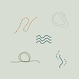
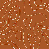
Inspired by topographic maps; contours of the land rising and dipping; planning adventure trail rides; watching the water movement create ripples and the undulating land in the Waikato.
Key landscape features have been intertwined into the design, bridging the divide from the land to river flowing through the illustration. Unique, just like a fingerprint.
You can look down at the illustration with a bird’s eye point of view: looking at the contour lines of land and water meeting. An alternative view is like a cross-section: with the hint of Maungatautari looming across the top range, and the river reaching up to meet the land.
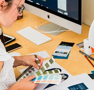
I moved away from the dated orange and lime colour combo, and instead focused on the natural hues in the area - river toned blues, green trees and dusty coppers picking up the trails and seasonal leaves. Deep river blues became the accent colour, as the river is the feature in every tour.
Colours, mixed with contour lines and bespoke illustrations create a variety of elements that can be used for the supporting brand designs, connecting the logo and creating a recognisable design. Contour lines are extended into custom cutout type throughout the site and other design items.

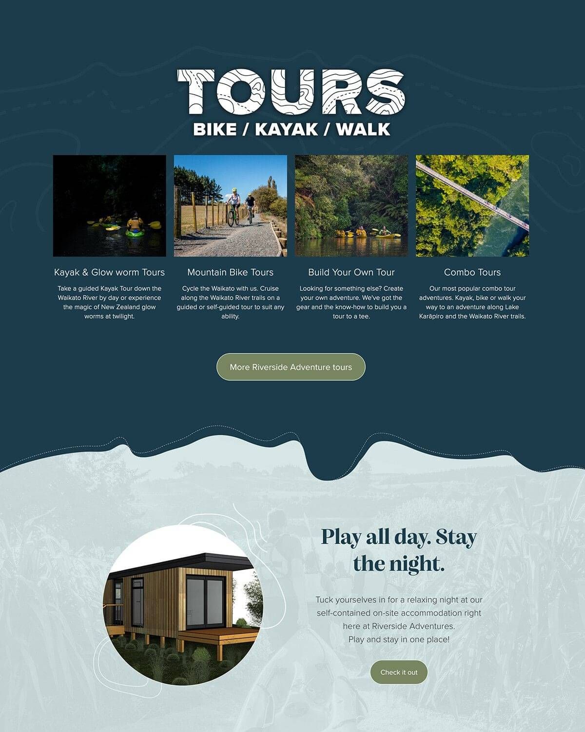
The Redesigned Website
A completely clean slate was needed for this project, from the design, colours, content and technical aspects. Over time, the site had been added to, tweaked and somewhat pushed aside when it came to usability and aesthetics. Lots of pages with lots of text.... does not make a user book!
Working with my trusted copywriter, Pippa Jayne, we nutted it out to reduce and simplify as best as we could - standard content pages, and detailed tour offerings got a clean sweep and a tidy up. Built in SEO to strengthen an already popular site and activity, thought given to structure and layout of content too.
I pushed this site to the technical limits! Adding layers of complexity, yet keeping it simple and still adapting seamlessly to mobile devices was my challenge: How do I make something look incredible on desktop only to fall back on mobile?
Customising and fine-combing every aspect of this website was what made Riverside Adventures stand out to win Rocketspark's Site of the Month in October 2021.
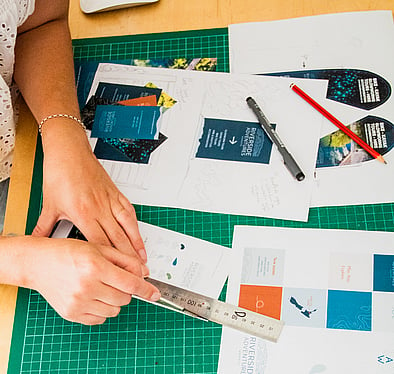
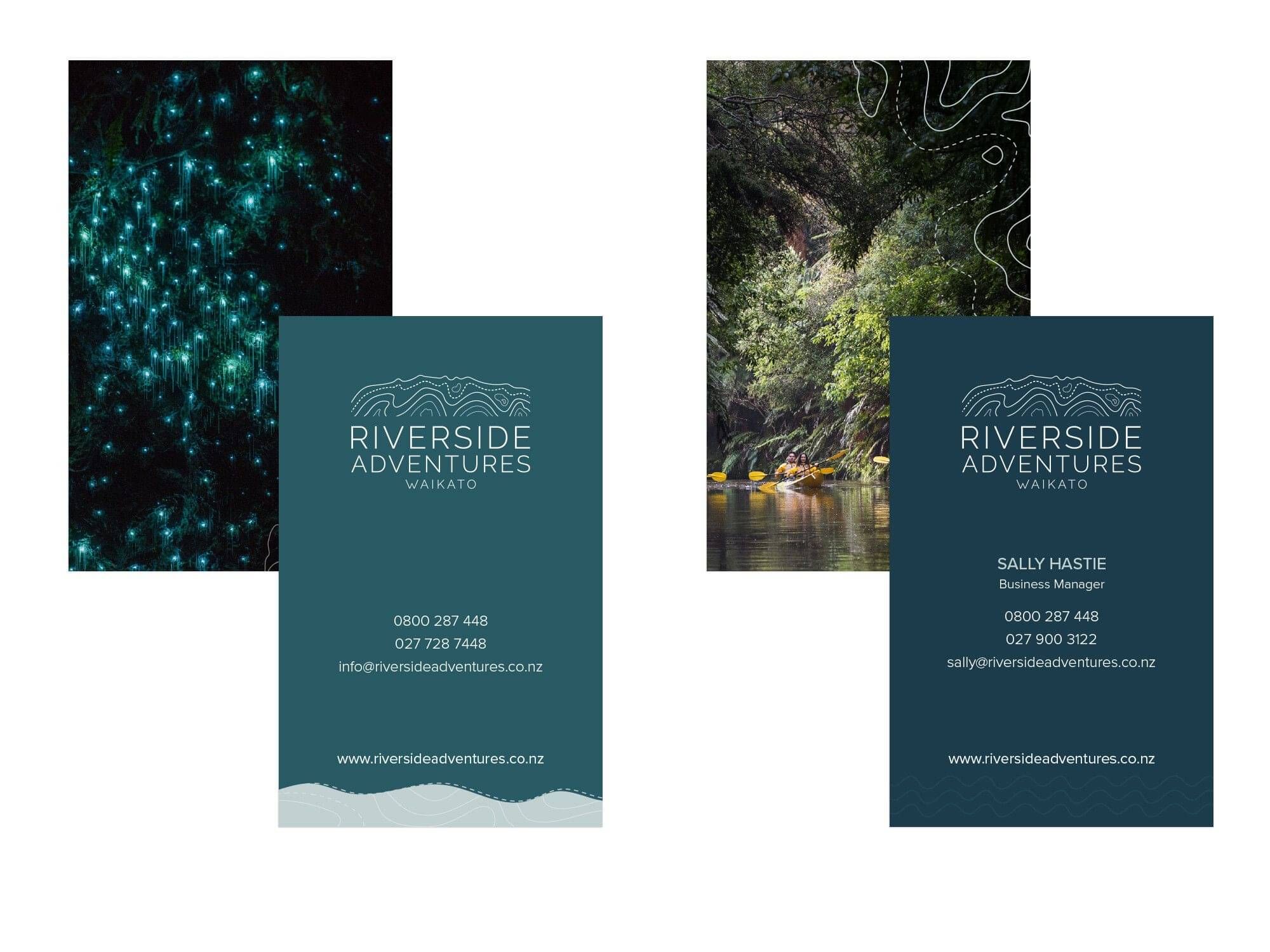
Business Cards
New business cards designed, this will make networking in the area easier, as well as leaving a couple of cards out for guests to take home from their stay.
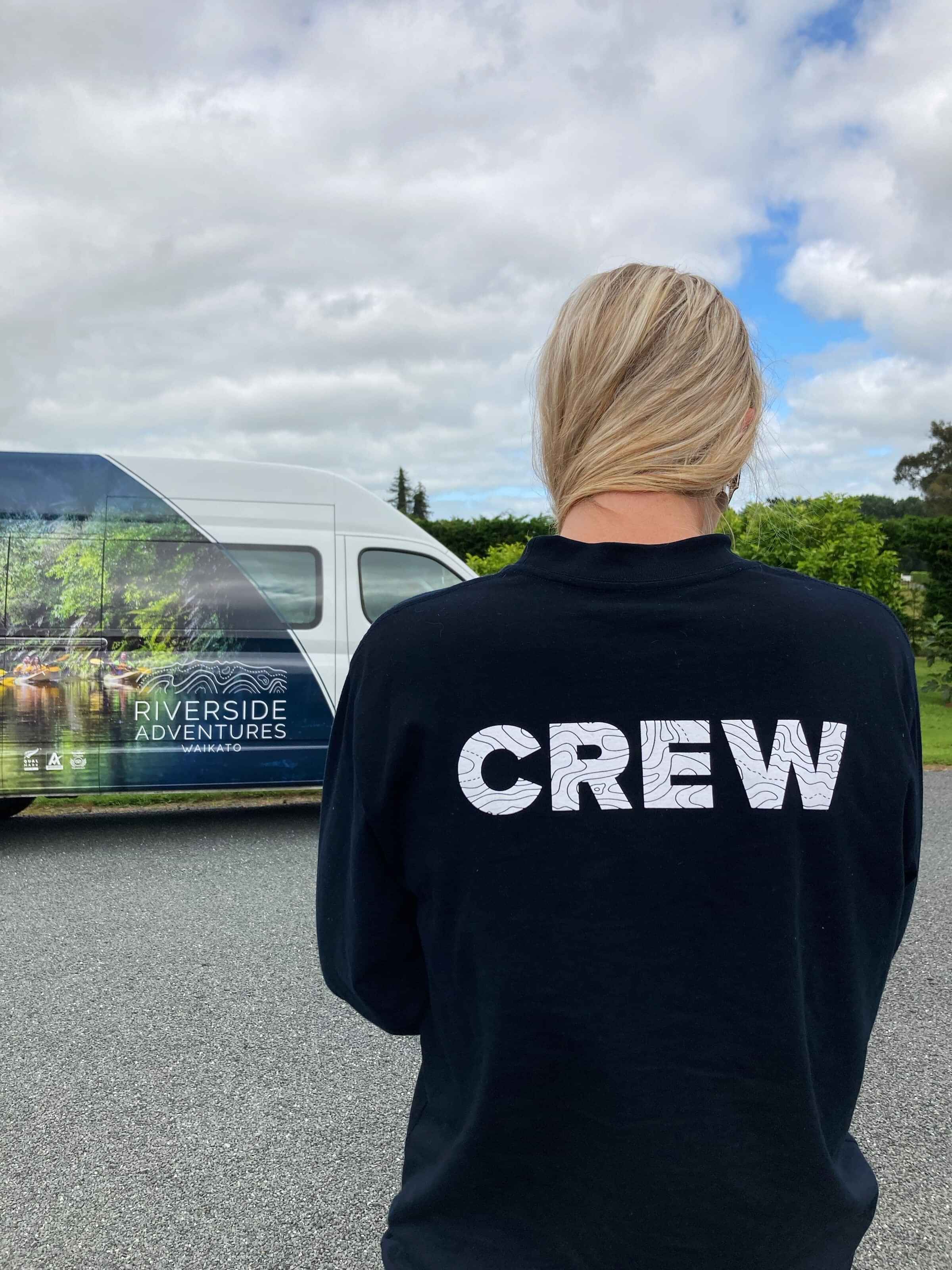
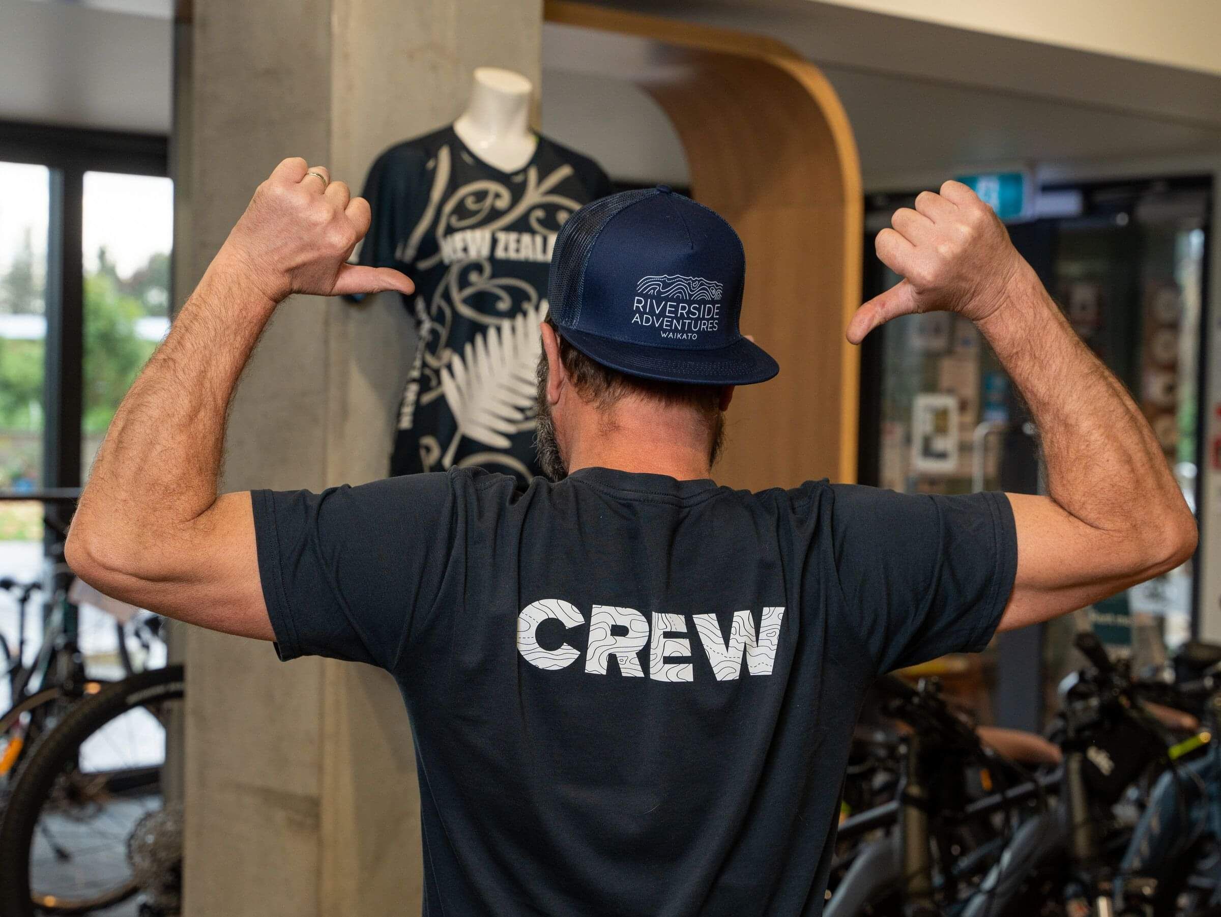
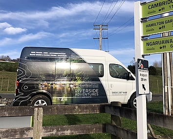
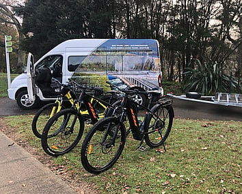
Vehicles and Uniforms
Branding goes beyond a business card or website - vehicles are the best form of advertising out and about! Full photo based graphics and refreshed with brand colours now make the shuttle vehicles stand out and you know where you're going!
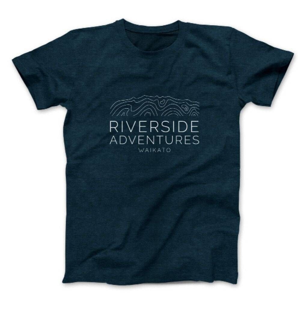
Staff uniforms extended to tees and long sleeved tops with 'CREW' in contour style type. These are to make it easy to locate the crew on tours and around base. They even got little kids tees too!
Social Media Tiles
Revamping a rebrand is one thing... revamping social media is another! A series of tiles were designed to promote the brand aspects and designs, to mix in between adventure based photos. These tiles help bring awareness and recognition while fitting in and contrasting nicely with photo content.
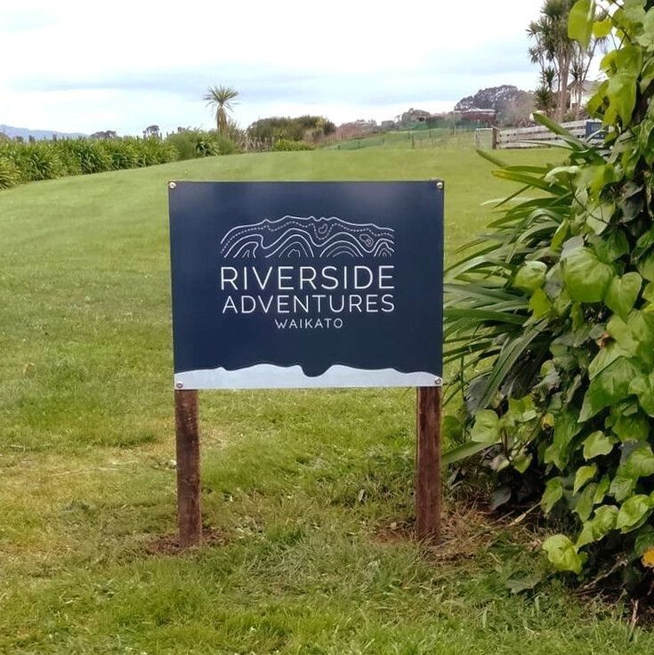
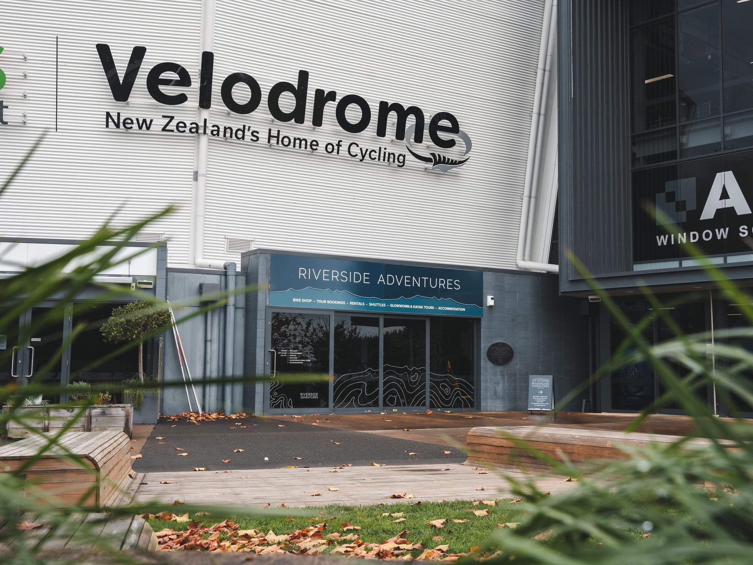
Exterior Signs
All signs needed updating - some were made larger too, helping to direct adventure-goers to the right place. A variety of designs were created, using different forms of the branding elements to create cohesion without looking matchy-matchy. Teardrop flag signs showcasing glowworms and trails were updated and provide a portable option when needed.
Printed on a durable heavy duty UV plastic with reinforced steel, these signs are set to last a lot longer than corflute.
We feel so grown up with our new branding! Love it, you have done so much for us.
Sally.

