- PROJECT CASE STUDY -
Little Moas, Auckland ELC
- Brand Design
- Rocketspark Website
- Social Media Templates
- Stationery

Web Design and Branding
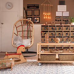
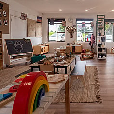
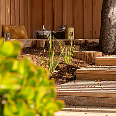
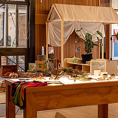
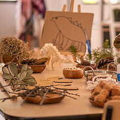
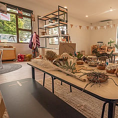
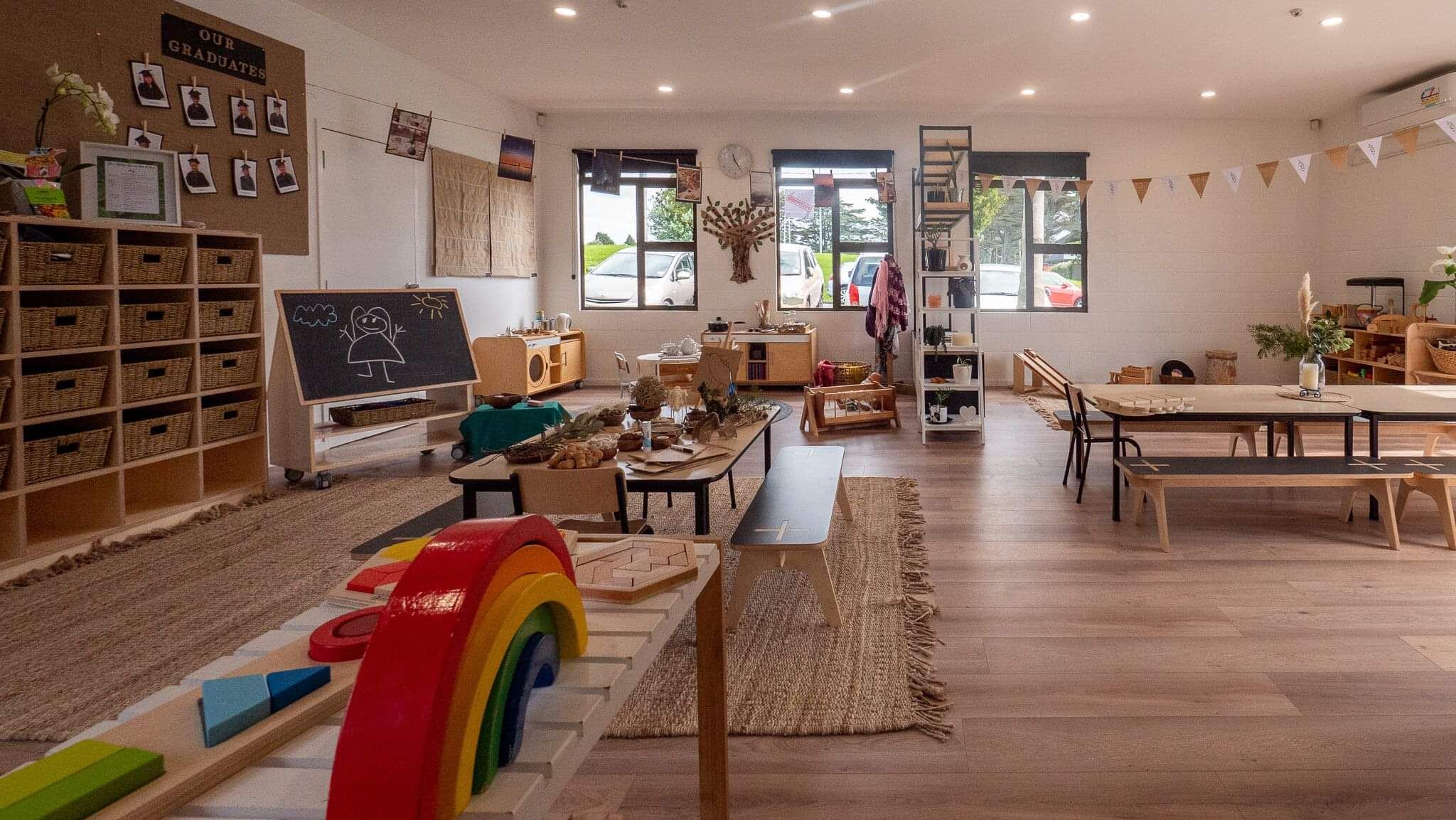
Little Moas, an Early Learning Centre in Auckland, has recently come under new management, undergoing renovations and a sustainability overhaul as well. All the little things like natural toys and learning resources, non-toxic paint and crafts, reusable nappies, eco-friendly products and healthy whole food for the kids.
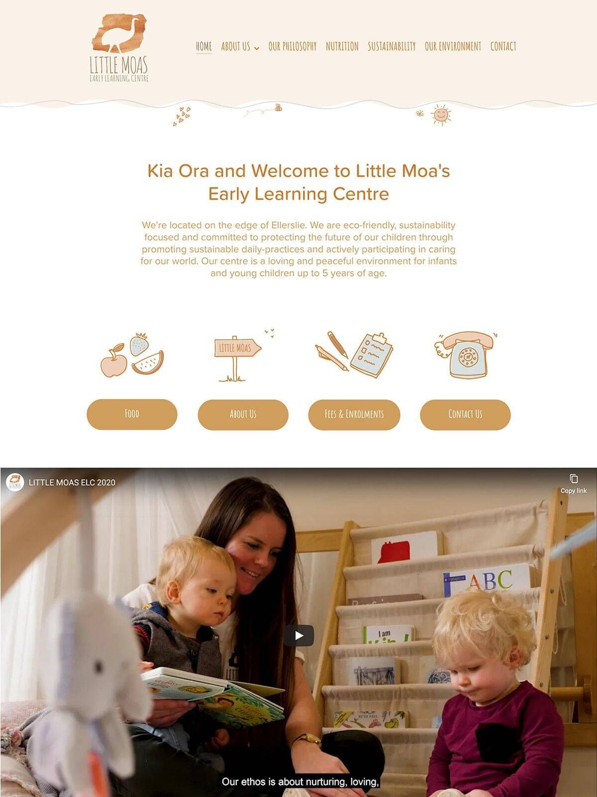
As part of their centre overhaul, Little Moas were keen to update their website and have help to establish their branding. Shifting the website over to Rocketspark, maintaining ownership of their domains (instead of the old web developer owning them!) and redesigning the entire site to reflect the changes at the centre was key.


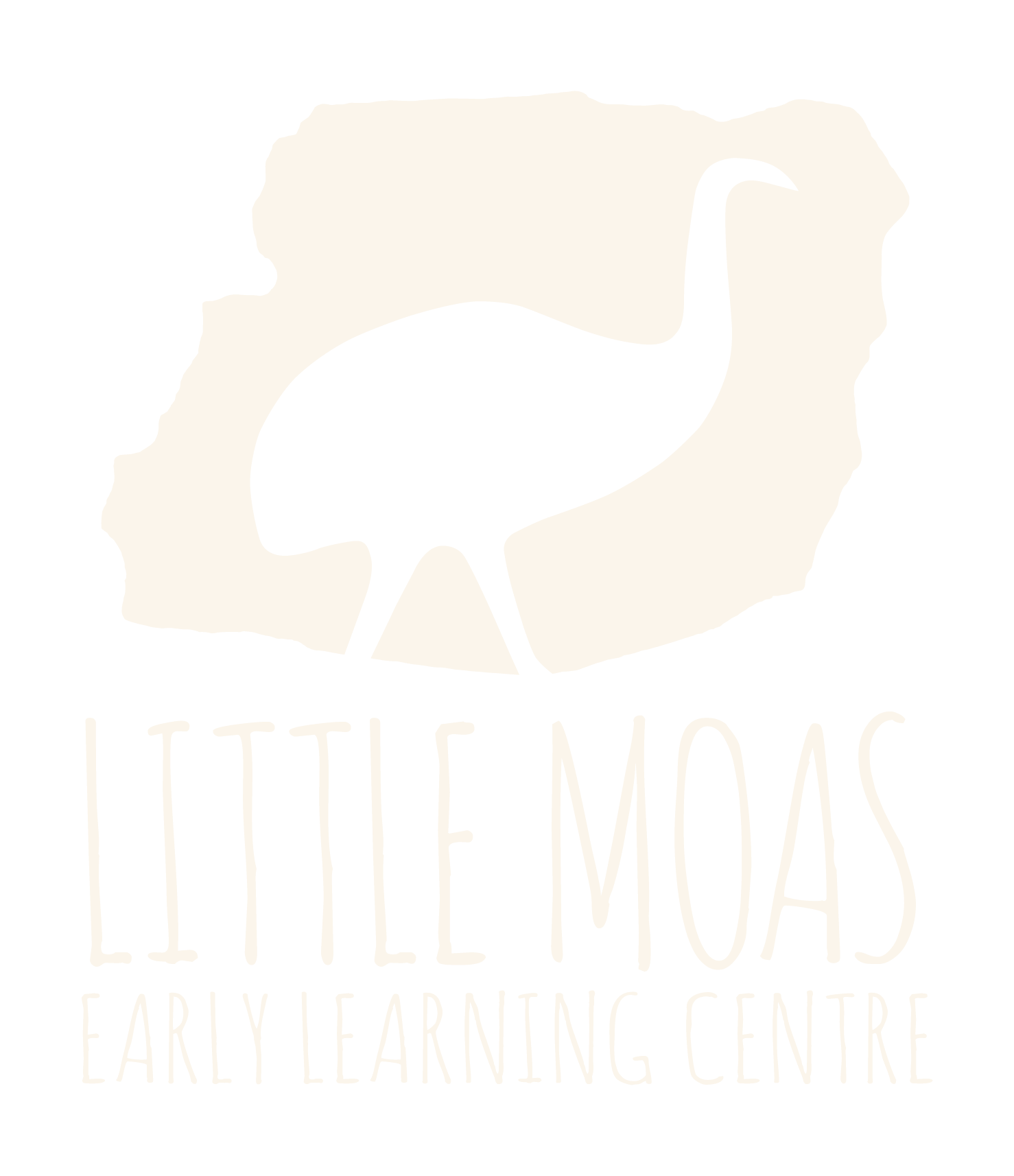
The Brand
While the existing logo was a DIY project by the manager; it just needed a little expert help - a high quality variation with a watercolour background, as well as some colour alternatives for background variants. Plus - the all important file type versions, (scaleable PDF, see through PNGs, as well as JPGs) so that there is always the perfect logo on hand!
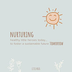
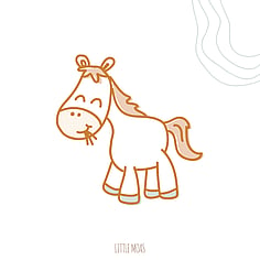
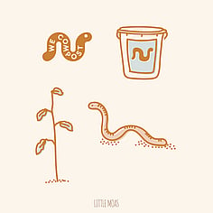
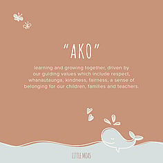
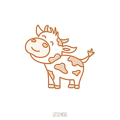
To set the branding in place, a collection of hand drawn elements were established, ranging from flowers, a happy sun, butterflies, hearts, a whale and more. Some of these are animated on the website to show the fun and care at Little Moas.
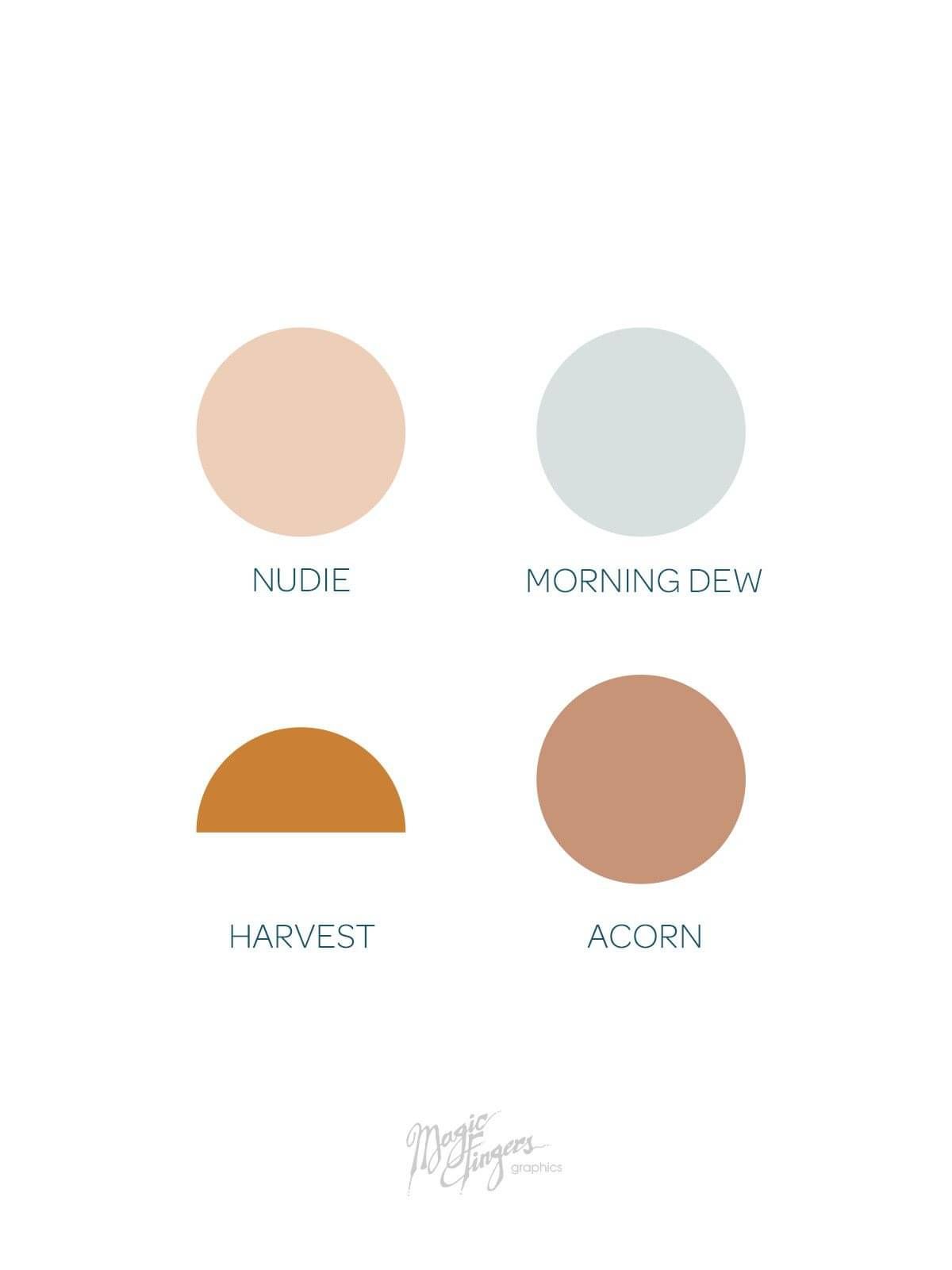
Branding Colour
I developed a natural and neutral colour palette that reflected the centre - wood, natural toys, organic, play features outdoors and a general sense of calming in the muted blue tone. These colours evoke a sense of nurturing care, as well as the sustainable and eco focus.
An established colour palette gives Little Moas a consistent brand presence anywhere they create - from website updates, to social media posts, or in-house flyers and items for their centre parents & kids.
The redesigned website
A complete website overhaul was needed - Little Moas were tired of struggling to update a clunky old and outdated Wordpress site. I built their website on Rocketspark, which is a simple user-friendly web system that they can use to update their content at any time.
Armed with new photographs of the centre, as well as a video; I made use of these visual aids to show off the centre as much as we could. Incorporating the hand drawn illustrations help enhance the site and give it a friendly and gentle feel, speaking volumes to the parents purely by imagery. The hand drawn custom-made illustrations also gives the website a step above some of their competitors.
Take a look at the before/after of the website.
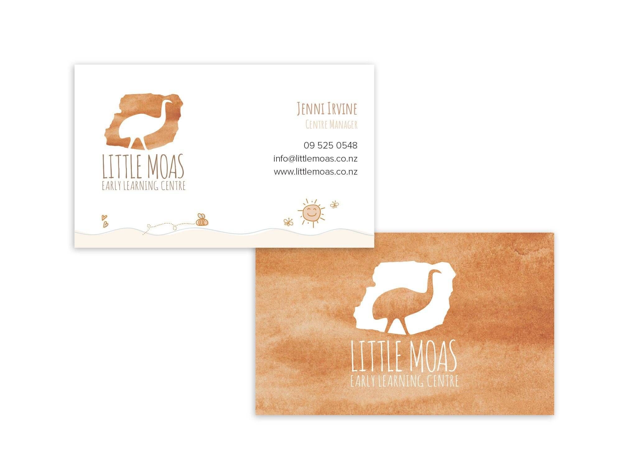
Business Cards
Continuing on with the brand overhaul, the little things needed updating - new business card designs incorporating the brand illustrations and colours. This provides consistency for all their marketing and new enquiries with parents too.
Social Media Content
In addition to the website, branding & signage, an instagram/facebook media pack was provided.
This allows the manager to upload branded illustration images to their social feed at anytime, with photos mixed in to aid in showcasing the centre to prospective or current parents.
A snippet of content is shown below.